Best Resume Fonts for 2026: The Ultimate Guide to Professional Resume Typography
When it comes to landing your dream job, every detail on your resume matters — including the font you choose. The best resume fonts for 2026 can mean the difference between your application being read or skipped. Hiring managers spend an average of just 7.4 seconds scanning a resume, so your typography needs to work hard to make a positive first impression.
In this comprehensive guide, we will cover the best resume fonts for 2026, why font choice matters, which fonts are ATS-friendly, and expert typography tips to help your resume get noticed — and hired.
Why Your Resume Font Choice Matters More Than You Think
Your resume font is not just about aesthetics — it directly impacts readability, professionalism, and even whether your resume passes Applicant Tracking Systems (ATS). A poorly chosen font can make your resume look amateurish or, worse, get automatically rejected by screening software.
First Impressions in Seconds
Recruiters form an impression of your resume within milliseconds. A clean, professional font signals attention to detail and respect for industry standards. An overly decorative or unusual font suggests the opposite.
ATS Compatibility Is Critical
Most large companies use ATS software to screen resumes before a human ever sees them. Some fonts — especially script or decorative ones — cannot be parsed correctly by ATS systems. Using a standard, ATS-friendly font ensures your qualifications are read and ranked properly.
Readability for Busy Recruiters
Recruiters often review hundreds of resumes per day. Fonts that are difficult to read, too small, or too stylized force extra effort from the reader. The best resume fonts make information easy to scan and digest quickly.
The Best Resume Fonts for 2026
After analyzing industry standards, recruiter preferences, and ATS compatibility, here are the top resume fonts for 2026:
1. Arial — The Safe and Reliable Choice
Best for: Almost any industry
Font type: Sans-serif
ATS compatibility: Excellent
Recommended size: 10.5–12pt
Arial is the default choice for many professionals for good reason. It is clean, widely available, and universally recognized by ATS systems. If you are unsure which font to pick, Arial is your safest bet. It works particularly well for corporate and traditional industries like finance, law, and consulting.
2. Calibri — The Modern Standard
Best for: Modern workplaces, tech, startups
Font type: Sans-serif
ATS compatibility: Excellent
Recommended size: 10.5–12pt
Calibri has been the default font for Microsoft Office since 2007, making it one of the most recognized professional fonts worldwide. Its rounded, friendly appearance offers a modern look while maintaining full professionalism. Calibri is particularly popular in tech and creative industries.
3. Garamond — The Elegant Classic
Best for: Creative fields, design, publishing
Font type: Serif
ATS compatibility: Good
Recommended size: 11–12pt
Garamond is a timeless serif font that exudes elegance and sophistication. Its thin strokes allow you to fit more text on a page without looking cramped — perfect for fitting a resume onto one page. However, due to its thinner lines, ensure you use at least 11pt for readability.
4. Helvetica — The Professional Favorite
Best for: Design, marketing, corporate roles
Font type: Sans-serif
ATS compatibility: Excellent
Recommended size: 10.5–12pt
Helvetica is widely regarded as one of the most beautiful and readable sans-serif fonts ever created. It has a clean, neutral appearance that works across industries. Many designers prefer Helvetica for its professional yet approachable look.
5. Times New Roman — The Traditional Standard
Best for: Law, academia, conservative industries
Font type: Serif
ATS compatibility: Excellent
Recommended size: 11–12pt
Times New Roman is the old reliable of resume fonts. While some consider it outdated, it remains a standard in law, academia, and traditional corporate environments. It is highly ATS-compatible and widely respected in conservative fields.
6. Lato — The Modern Sans-Serif
Best for: Tech, startups, modern industries
Font type: Sans-serif
ATS compatibility: Excellent
Recommended size: 10–11.5pt
Lato is a contemporary sans-serif font that balances warmth and professionalism. It was designed for corporate use and offers excellent readability at various sizes. Lato is available as a free Google Font, making it accessible for any job seeker.
7. Georgia — The Web-Friendly Serif
Best for: Remote jobs, digital-first roles, editorial
Font type: Serif
ATS compatibility: Good
Recommended size: 10.5–12pt
Georgia was designed for readability on screens, making it an excellent choice for digital resume submissions. Its generous letter spacing and clear character shapes ensure legibility even at smaller sizes.
8. Roboto — The Versatile Performer
Best for: Tech, engineering, modern workplaces
Font type: Sans-serif
ATS compatibility: Excellent
Recommended size: 10–11.5pt
Roboto is the default font for Google’s Android and Material Design. Its dual nature — mechanical skeleton with geometric forms — gives it a modern, professional appearance that works beautifully on both screen and print.
Fonts to Avoid on Your Resume in 2026
Just as important as choosing the right font is avoiding the wrong ones. Here are fonts that can hurt your chances:
- Comic Sans — Unprofessional and juvenile. Never use this on a resume.
- Papyrus — Overly decorative and distracts from content.
- Jokerman / Curlz MT — Script and display fonts that look amateurish.
- Bauhaus 93 — Hard to read and not ATS-friendly.
- Harrington — Too ornamental for professional use.
- Brush Script MT — Difficult for ATS to parse and looks informal.
Serif vs. Sans-Serif: Which Is Best for Your Resume?
The age-old debate continues in resume typography. Here is how to decide:
Sans-Serif Fonts (e.g., Arial, Calibri, Helvetica)
- Modern and clean appearance
- Better for digital screens
- Slightly better ATS compatibility
- Preferred in tech and modern industries
- More approachable and friendly
Serif Fonts (e.g., Garamond, Times New Roman, Georgia)
- Traditional and authoritative appearance
- Better for printed resumes
- Good ATS compatibility (but check specific fonts)
- Preferred in law, academia, and conservative fields
- Can convey experience and reliability
Our verdict: For most job seekers in 2026, a clean sans-serif font like Calibri, Arial, or Lato is the safest and most versatile choice. If you are applying to conservative industries like law or academia, Times New Roman or Georgia can work well.
Resume Font Size Guidelines for 2026
Choosing the right font size is just as important as choosing the right font. Here are the standard guidelines:
- Your name / header: 16–20pt (bold recommended)
- Section headings: 12–14pt (bold)
- Body text: 10.5–12pt
- Contact information: 10–11pt
- Minimum readable size: Never go below 10pt
How to Choose the Best Resume Font for Your Industry
Corporate / Finance / Law
Stick with traditional fonts: Times New Roman, Arial, or Garamond. These industries value convention, and an unusual font choice may be seen as a risk.
Tech / Startups / IT
Modern sans-serif fonts like Calibri, Lato, Roboto, or Helvetica work best. These industries value clean design and contemporary aesthetics. A touch of personality is acceptable but keep it professional.
Creative / Design / Marketing
You have more freedom but should still prioritize readability. Helvetica, Lato, or Garamond are great choices. Consider your resume design as a portfolio piece — the font should complement your personal brand.
Healthcare / Education / Nonprofit
Clear, approachable fonts like Calibri, Arial, or Georgia work well. Prioritize readability and warmth over flashiness.
ATS-Friendly Fonts: What You Need to Know
Applicant Tracking Systems scan your resume for keywords and qualifications. Here is what you need to know about ATS and fonts:
- Stick to standard system fonts like Arial, Calibri, Times New Roman, and Helvetica. These are universally recognized by ATS software.
- Avoid unusual Unicode characters — bullet points, arrows, and special symbols may not render correctly.
- Do not use text boxes or tables for critical information — ATS systems often fail to read text within them.
- Use standard font weights — avoid light or thin font variants that may not scan properly.
- Save as PDF or DOCX — these formats preserve font rendering best. However, check the job posting for preferred format.
For more detailed guidance on making your resume ATS-friendly, check out our complete guide to AI-powered resume building.
Expert Typography Tips for a Professional Resume in 2026
- Stick to one font throughout — Use a single font family for consistency. You can vary weight (bold, regular) and size for hierarchy.
- Limit to two fonts maximum — If you use two fonts, pair a sans-serif header with a serif body, or vice versa. Ensure they complement each other.
- Use bold and italic sparingly — Bold for headings and key achievements. Italic for subtle emphasis, but avoid overuse.
- Maintain consistent spacing — Use 1.0–1.15 line spacing for body text. Keep margins between 0.5 and 1 inch.
- Test your resume on different devices — What looks good on your screen may look different on a recruiter’s. Send yourself a PDF to check.
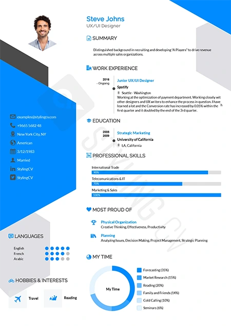
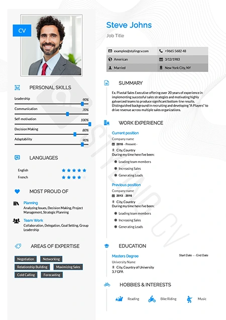
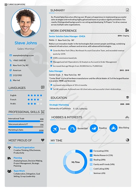
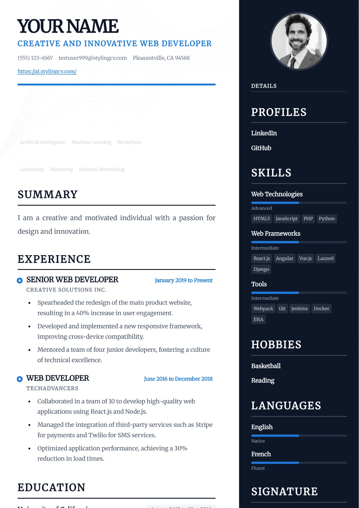
- Consider your resume template — A well-designed template handles typography decisions for you. Use our AI resume builder at ai.stylingcv.com to create a professionally formatted resume in minutes.
Frequently Asked Questions About Resume Fonts
What is the most professional font for a resume?
Calibri and Arial are widely considered the most professional and safest choices for resumes in 2026. Both are clean, ATS-friendly, and universally recognized by recruiters.
Is Times New Roman outdated for resumes?
While Times New Roman is considered traditional, it is not outdated — especially in conservative industries like law, finance, and academia. However, for modern industries, a sans-serif font like Calibri or Lato is preferred.
Can I use a different font for my name on a resume?
Yes, using a slightly larger or bolder font for your name is standard practice. Just ensure it matches or complements your body font style for a cohesive look.
Does font choice affect ATS score?
Yes. Some fonts cannot be read by ATS software, which may cause your resume to be rejected before a human sees it. Stick to standard system fonts like Arial, Calibri, or Times New Roman for best ATS compatibility.
What font size is best for a resume?
11–12pt for body text is the standard. Your name can be 16–20pt, and section headings should be 12–14pt. Never go below 10pt for any content.
Ready to create a professionally formatted resume with the perfect font? Try our AI-powered resume builder at ai.stylingcv.com — it automatically applies the best typography for your industry and ensures ATS compatibility. Build your perfect resume in under 10 minutes!
For more guidance, see our USA Resume Writing Guide 2026.
For more guidance, see our How to Write a Resume Summary.