What font and font size should I use for my resume?
Category: Resume Writing FAQ
What font and font size should I use for my resume?
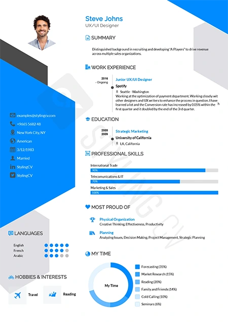
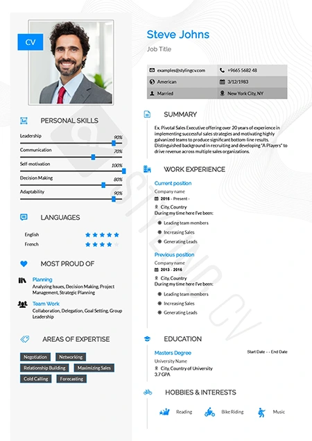
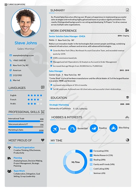
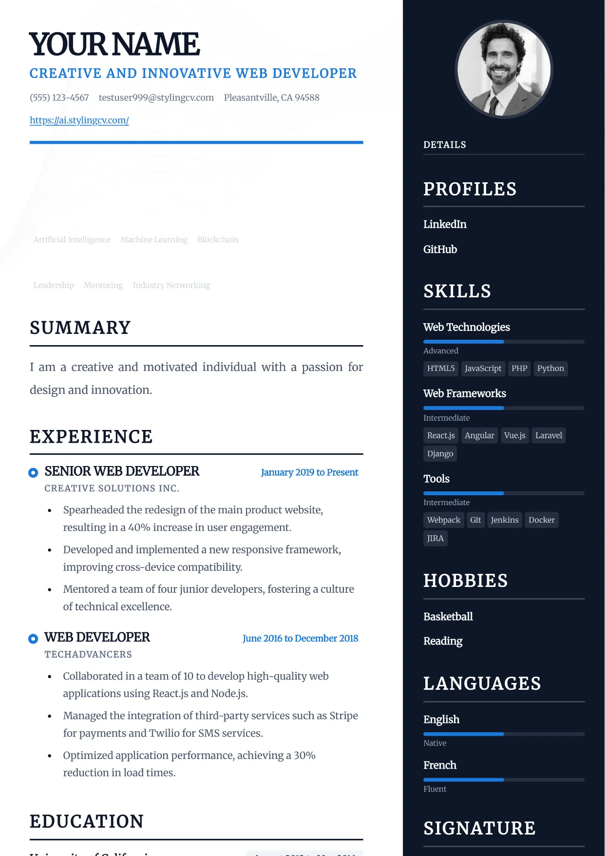
Choose professional, easily readable fonts that work well both on-screen and printed. Best font choices: Arial (clean, modern, ATS-friendly), Calibri (default in many systems, professional), Garamond (elegant, space-efficient), Georgia (readable, professional serif), Times New Roman (traditional, slightly dated but safe), Helvetica (classic, professional), Cambria (modern serif), Book Antiqua (professional serif alternative). Font size: Your name in header: 16-20 points. Section headings: 12-14 points (bold). Body text and bullets: 10-12 points (11 is ideal). Never go below 10 points – it strains readability. Resume margins: 0.5-1.0 inches on all sides. If struggling to fit content, try 0.5 inches, but never less. Consistency is crucial: use the same font throughout your resume (one font family total). You can vary between regular, bold, and italic for emphasis, but don’t mix different font families. Avoid: Comic Sans, Papyrus, or other casual/decorative fonts (unprofessional), script or handwriting fonts (hard to read, not ATS-friendly), fonts under 10pt (too small), mixing multiple different fonts (looks chaotic). Test your resume: print it and read from arm’s length. If it’s hard to read, increase font size or simplify formatting. ATS consideration: stick to standard fonts that every system recognizes. Exotic fonts may not parse correctly.
Need Help with Your Resume?
Our AI-powered resume builder at StylingCV AI can help you create an ATS-optimized, professional resume in minutes. Get started today!
{ “@context”: “https://schema.org”, “@type”: “FAQPage”, “mainEntity”: [{ “@type”: “Question”, “name”: “What font and font size should I use for my resume?”, “acceptedAnswer”: { “@type”: “Answer”, “text”: “Choose professional, easily readable fonts that work well both on-screen and printed. Best font choices: Arial (clean, modern, ATS-friendly), Calibri (default in many systems, professional), Garamond (elegant, space-efficient), Georgia (readable, professional serif), Times New Roman (traditional, slightly dated but safe), Helvetica (classic, professional), Cambria (modern serif), Book Antiqua (professional serif alternative). Font size: Your name in header: 16-20 points. Section headings: 12-14 points (bold). Body text and bullets: 10-12 points (11 is ideal). Never go below 10 points – it strains readability. Resume margins: 0.5-1.0 inches on all sides. If struggling to fit content, try 0.5 inches, but never less. Consistency is crucial: use the same font throughout your resume (one font family total). You can vary between regular, bold, and italic for emphasis, but don’t mix different font families. Avoid: Comic Sans, Papyrus, or other casual/decorative fonts (unprofessional), script or handwriting fonts (hard to read, not ATS-friendly), fonts under 10pt (too small), mixing multiple different fonts (looks chaotic). Test your resume: print it and read from arm’s length. If it’s hard to read, increase font size or simplify formatting. ATS consideration: stick to standard fonts that every system recognizes. Exotic fonts may not parse correctly.” } }] }Related: resume font, font size, typography, formatting, professional fonts