What’s the best font and formatting to use for a resume?
What’s the Best Font and Formatting to Use for a Resume? Crafting a standout resume starts with choosing the right font and formatting. A cluttered or overly stylized layout can bury your skills, while clean, professional design puts your qualifications front and center. The best font and formatting for a resume balances readability with personality,…
Sarah Reynolds
Content Specialist
What’s the Best Font and Formatting to Use for a Resume?
Crafting a standout resume starts with choosing the right font and formatting. A cluttered or overly stylized layout can bury your skills, while clean, professional design puts your qualifications front and center. The best font and formatting for a resume balances readability with personality, ensuring hiring managers (and applicant tracking systems) can quickly spot what makes you the ideal candidate.
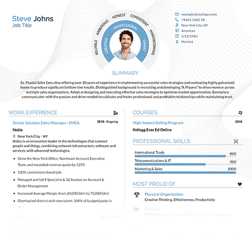
Your resume’s visual appeal matters more than you think. Fonts like Arial or Calibri keep things modern, while classics like Times New Roman add timeless polish. Pairing these with smart formatting—consistent spacing, clear headings, and bullet points—creates a document that’s both eye-catching and easy to navigate. Let’s break down how to nail this balance.
Key Features of a Well-Formatted Resume
- Readable Fonts: Stick to 10–12 pt sizes for body text. Avoid script or overly decorative fonts.
- Clear Hierarchy: Use bold headers, italics for job titles, and bullet points for achievements.
- White Space: Margins of 0.5–1 inch prevent overcrowding, making your resume scan-friendly.
- ATS Compatibility: Skip columns or graphics that might confuse automated systems.
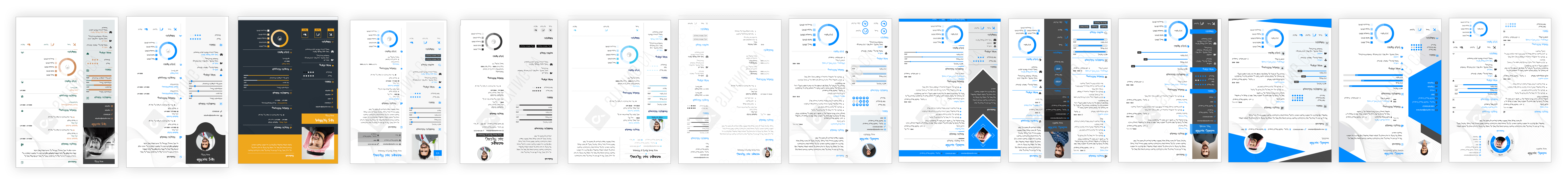
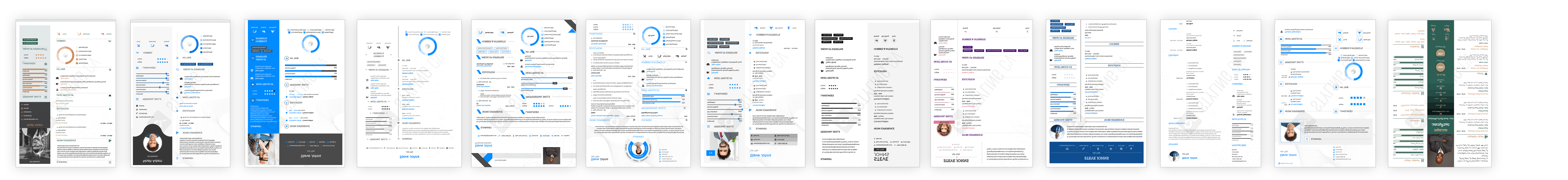
Top Resume Templates for Flawless Formatting
These high-quality resume templates combine sleek design with functionality:
- Modern Pro: Clean lines, subtle accent colors, and a two-column layout for tech or creative fields.
- Classic Elegance: Timeless structure with bold section headers, ideal for corporate roles.
- Minimalist Edge: Ample white space and simple fonts for easy ATS parsing.
Customization Tips to Make Your Resume Shine
- Adjust font sizes to highlight your name (14–16 pt) and section headers (12–14 pt).
- Use italics for employers or dates, and bold for job titles.
- Save your resume as a PDF (unless the job posting specifies otherwise).
FAQs About Resume Fonts and Formatting
Should I use serif or sans-serif fonts on a resume?
Sans-serif fonts (Arial, Helvetica) work best for digital readability. Serif fonts (Georgia, Times New Roman) suit traditional industries like law or finance.
Can I use color in my resume?
Yes—sparingly. Use muted tones for headers or accents. Avoid neon colors or busy backgrounds.
How long should my resume be?
Stick to one page for less than 10 years of experience. Two pages are acceptable for senior roles.
Are creative fonts okay for design jobs?
Yes, but keep body text simple. Pair a creative header font with a neutral one (like Open Sans) below.
Is a PDF or Word doc better?
PDFs preserve formatting. Use Word only if required by the employer.
Why Formatting Matters for Your Job Search
A well-designed resume isn’t just about aesthetics—it’s your first impression. The best font and formatting for a resume ensure your skills shine without distractions. Ready to stand out? Explore professional resume templates tailored to your industry, and start crafting a resume that gets results.
Related articles

Build your resume in 10 minutes
Use professional field-tested resume templates that follow the exact ‘resume rules’ employers look for. Create My Resume
BUILD MY RESUME NOW