What’s the Best Font and Formatting to Use for a Resume?
What’s the Best Font and Formatting to Use for a Resume? Why Your Resume’s Font and Formatting Matter Choosing the best font and formatting for your resume isn’t just about looks—it’s about clarity and professionalism. Hiring managers skim resumes in seconds, so a clean layout with readable fonts ensures they spot your skills fast. A…
Sarah Reynolds
Content Specialist
What’s the Best Font and Formatting to Use for a Resume?
Why Your Resume’s Font and Formatting Matter
Choosing the best font and formatting for your resume isn’t just about looks—it’s about clarity and professionalism. Hiring managers skim resumes in seconds, so a clean layout with readable fonts ensures they spot your skills fast.
A cluttered design or hard-to-read typeface can tank your chances even if you’re qualified. Stick to fonts like Arial or Calibri for modern appeal, and use bullet points to highlight achievements.
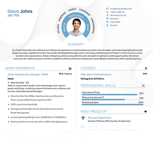
Key Features of a Standout Resume
- Readable Fonts: Use sans-serif fonts (e.g., Helvetica) for digital readability.
- Section Headers: Bold or slightly larger text to separate sections like “Experience” or “Education.”
- Consistent Spacing: Balance white space to avoid overcrowding.
- ATS Compatibility: Avoid graphics or columns that confuse applicant tracking systems.
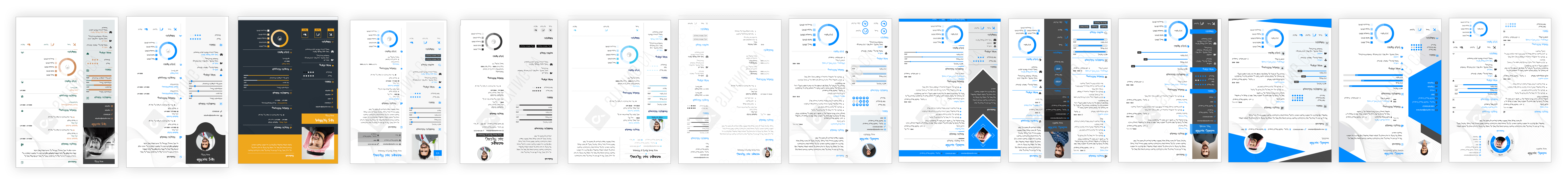
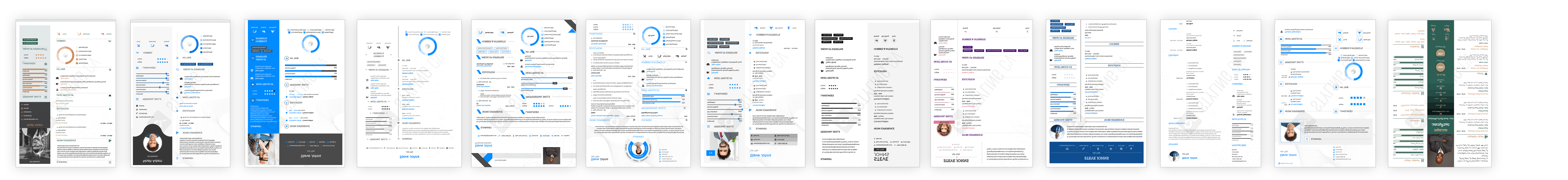
Top Resume Templates for Every Career
Check out these ATS-friendly templates from StylingCV:
- Modern Professional: Clean lines with Calibri font—ideal for corporate roles.
- Minimalist Flow: Ample white space paired with Roboto—great for creative fields.
- Traditional Elegance: Timeless Times New Roman layout suited for academia or law.
How to Customize Your Resume Formatting
- Adjust margins: Keep between 0.5”–1” for balanced text flow.
- Mix font sizes: Use 11–12pt for body text; 14–16pt for headers.
- Emphasize key skills: Bold job titles or certifications to grab attention quickly.
- Test print/AST scans: Ensure no layout issues pop up unexpectedly.
Your Resume Font & Formatting Questions Answered
1. Should I use serif or sans-serif fonts on my resume?
Sans-serif (e.g., Arial) works best digitally. Serif fonts (e.g., Georgia) are okay for print-heavy industries like publishing.
2. How big should my resume font be?
Aim for 10–12pt—anything smaller strains the eyes; larger looks unpolished.
3. Can I use color in my resume?
Sparingly! Use muted shades for headers but avoid neon tones that distract.
4. How do I format multiple jobs without crowding?
List roles reverse-chronologically with 3–5 bullet points per job—focus on achievements.
5. Is a one-page resume still necessary?
Yes unless you have 10+ years of experience—keep it concise with smart formatting.
A Well-Formatted Resume Opens Doors
The right font and formatting make your resume scannable for hiring managers and ATS bots alike. Explore professionally designed templates at StylingCV’s library to find one that matches your industry’s vibe while keeping readability front and center.
Related articles

Build your resume in 10 minutes
Use professional field-tested resume templates that follow the exact ‘resume rules’ employers look for. Create My Resume
BUILD MY RESUME NOW