“What fonts are best for resumes?”
What Fonts Are Best for Resumes? (+ How to Choose Like a Pro) Picking the right font for your resume isn’t just about aesthetics—it’s about making sure hiring managers actually read your content. With recruiters skimming resumes in seconds, your font choice can mean the difference between “let’s interview them” and “next.” So what fonts…
Sarah Reynolds
Content Specialist
What Fonts Are Best for Resumes? (+ How to Choose Like a Pro)
Picking the right font for your resume isn’t just about aesthetics—it’s about making sure hiring managers actually read your content. With recruiters skimming resumes in seconds, your font choice can mean the difference between “let’s interview them” and “next.” So what fonts are best for resumes? Let’s break it down.
Fonts impact readability, professionalism, and even how applicant tracking systems (ATS) parse your resume. While creative careers might allow flexibility, most industries favor clean, modern fonts that balance personality with clarity. We’ll explore top options and share strategies to make your resume impossible to ignore.
Why Your Resume Font Matters
- Readability: Cluttered or overly decorative fonts strain the eyes.
- ATS Compatibility: Some fonts aren’t read correctly by automated systems.
- Professionalism: A polished font aligns with industry standards.
- Space Efficiency: Compact fonts let you share more without overcrowding.
Top Fonts for Resumes (Tested & Approved)
- Calibri: Modern default for Word—clean and ATS-friendly.
- Arial: Neutral sans-serif that works in any industry.
- Helvetica: A designer favorite for minimalist resumes.
- Garamond: Elegant serif for traditional fields like law or academia.
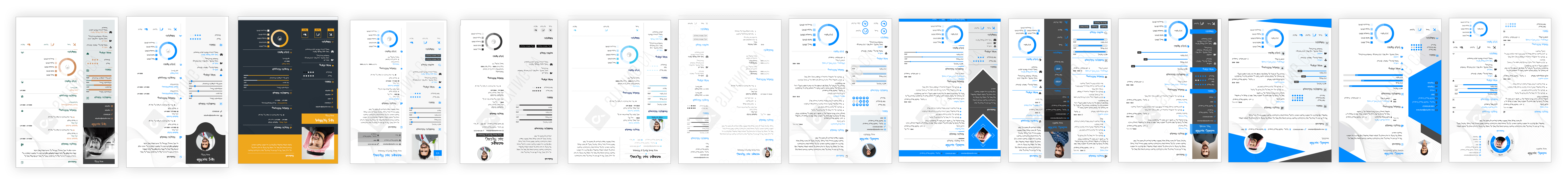
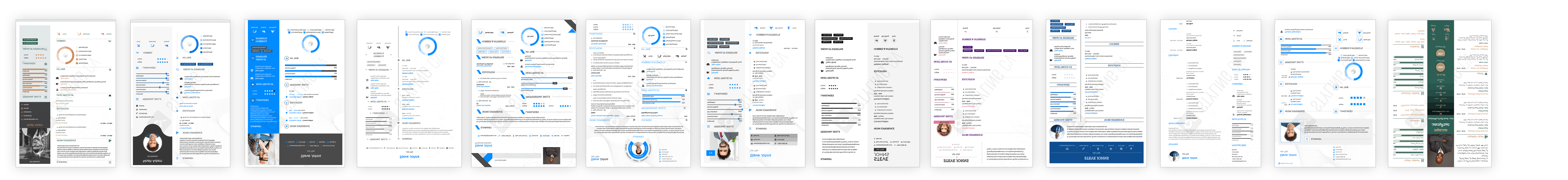
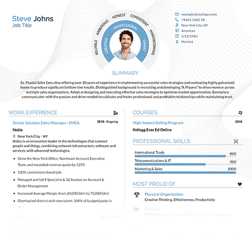
Templates That Nail Font Choices
Need inspiration? These high-quality resume templates use fonts strategically:
- “Modern Edge” Template: Pairs Helvetica headers with Calibri body text for sharp contrast.
- “Classic Professional” Template: Uses Times New Roman for industries where tradition matters.
- “Creative Flow” Template: Combines Lato with open spacing for design roles.
Crafting Your Resume: Pro Customization Tips
- Size it right: Stick to 10–12 pt for body text.
- Avoid “font soup”: Use one main font and a complementary accent.
- Test print it: Tiny fonts can look great on screens but vanish on paper.
The Questions Everyone Asks About Resume Fonts
Q: Can I use serif fonts like Times New Roman?
A: Yes—serifs work in conservative fields but avoid them if space is tight.
Q: What font size is too small?
A: Never go below 10 pt; 11 pt is safer for readability.
Q: Should I use “fun” fonts for creative jobs?
A: In moderation—use them only for headers and pair with simple body text.
Q: Do fancy fonts crash ATS systems?
A: Some do! Stick to widely recognized options like Arial or Georgia.
Q: Can I mix two fonts?
A: Yes—one for headers (e.g., Helvetica) and another for body text (Calibri).
The Bottom Line
The best fonts for resumes make your skills pop without distracting the reader or confusing software. If you’re stuck, templates like these professionally designed layouts handle spacing, sizing, and style so you can focus on content. Whether updating your resume or starting fresh, a thoughtful font choice is an easy win—don’t miss it!
Related articles

Build your resume in 10 minutes
Use professional field-tested resume templates that follow the exact ‘resume rules’ employers look for. Create My Resume
BUILD MY RESUME NOW