“How to avoid resume templates that look spammy?”
How to Avoid Resume Templates That Look Spammy and Unprofessional Job seekers often fall into the trap of using resume templates that look spammy, hurting their chances before they even land an interview. Templates crammed with flashy graphics, chaotic layouts, or mismatched fonts can scream “unprofessional” to hiring managers. Avoiding these red flags is critical…
Sarah Reynolds
Content Specialist
How to Avoid Resume Templates That Look Spammy and Unprofessional
Job seekers often fall into the trap of using resume templates that look spammy, hurting their chances before they even land an interview. Templates crammed with flashy graphics, chaotic layouts, or mismatched fonts can scream “unprofessional” to hiring managers. Avoiding these red flags is critical to making a strong first impression. Let’s break down practical ways to choose and customize templates that highlight your skills without looking like spam.
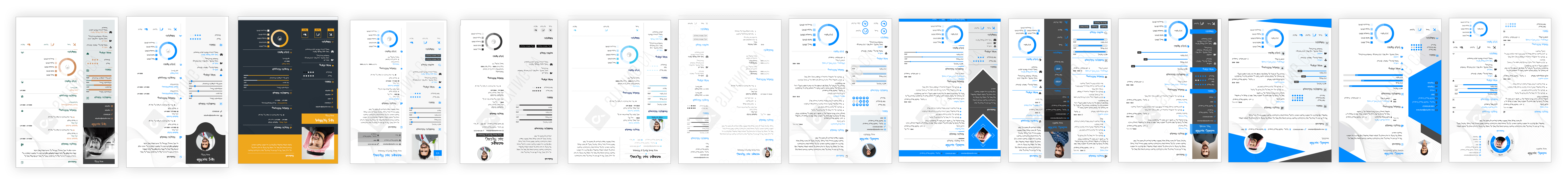
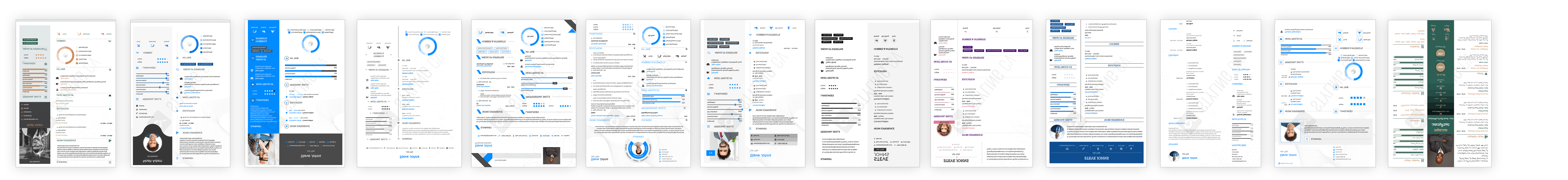
Resume templates that feel spammy often lack balance. They might overuse colors, include unnecessary icons, or prioritize style over readability. Such designs distract from your qualifications and can even confuse applicant tracking systems (ATS). The key is to find templates that feel polished, organized, and tailored to your industry. Here’s how to spot the difference between a spammy design and a professional one.
Key Features of Non-Spammy Resume Templates
- Clean Layouts: No overcrowded sections. White space and clear headings guide the reader naturally.
- Professional Fonts: Avoid Comic Sans or overly decorative fonts. Stick to timeless choices like Arial or Calibri.
- Minimal Color Use: Subtle accents (e.g., navy or dark gray) enhance readability without overwhelming.
- ATS-Friendly Formatting: Templates with clear headings, standard section titles, and no embedded graphics.
Top Professional Resume Templates to Avoid Spammy Designs
Need inspiration? Check these ATS-friendly, modern templates from StylingCV’s curated collection:
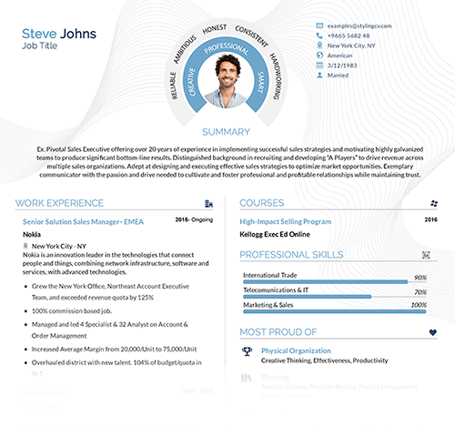
- Clean Professional: Crisp lines and balanced sections perfect for corporate roles.
- Modern Edge: Sleek design with muted color highlights for tech or creative fields.
- Classic Minimalist: Timeless and text-focused, ideal for conservative industries like law or finance.
Customization Tips to Keep Your Resume Looking Genuine
- Tailor Content First: Fill in your details before adjusting the design—experience should drive the layout.
- Avoid Over-Designing: If you’re adding icons or bars, ensure they don’t clash or look cartoonish.
- Test Readability: Share your resume with a friend. Can they quickly find your work history and skills?
Why a Well-Designed Resume Template Matters
A spammy-looking template can derail your job search, while a professional one builds credibility. Templates from trusted sources strike the right balance between personality and practicality. They help you stand out for your achievements, not your resume’s quirks.
Questions Job Seekers Ask About Avoiding Spammy Resumes
- What makes a resume template look “spammy”?
- Overloaded layouts, clashing colors, and non-standard fonts make resumes feel unprofessional and hard to trust.
- How do I pick the right template for my industry?
- Match the template’s tone to your field. Creative roles allow more color, while corporate jobs need simplicity.
- Are colorful templates always bad?
- Not if used sparingly. Use muted tones for headings or accents—never as backgrounds or large blocks.
- Can a template hurt my chances with ATS?
- Yes. Avoid templates with columns, graphics, or unusual section labels that ATS software can’t parse.
- Should I avoid free resume templates?
- Not all free templates are bad, but many sacrifice quality. Look for ones with reviews or examples of real hires.
Learning how to avoid resume templates that look spammy ensures your application reflects your professionalism. Check out tested, modern options to find a design that lets your experience shine.
Related articles

Build your resume in 10 minutes
Use professional field-tested resume templates that follow the exact ‘resume rules’ employers look for. Create My Resume
BUILD MY RESUME NOW