“How to avoid resume templates that look spammy?”
How to Avoid Resume Templates That Look Spammy: A Job Seeker’s Guide How to Avoid Resume Templates That Look Spammy Creating a resume that stands out for the right reasons is crucial for landing interviews. The problem? Many templates look spammy or outdated—think chaotic layouts, flashy colors, or irrelevant graphics. This instantly turns off hiring…
Sarah Reynolds
Content Specialist
How to Avoid Resume Templates That Look Spammy
Creating a resume that stands out for the right reasons is crucial for landing interviews.
The problem? Many templates look spammy or outdated—think chaotic layouts, flashy colors, or irrelevant graphics.
This instantly turns off hiring managers and makes your application feel unprofessional.
Avoiding spammy resume templates isn’t just about aesthetics; it’s about clarity and credibility.
Recruiters often skim resumes in seconds, so a cluttered or overly gimmicky design can bury your skills.
Let’s break down how to choose templates that feel polished and trustworthy.
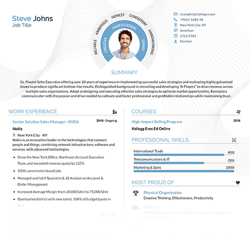
Key Features of Non-Spammy Resume Templates
- Simple Layouts: Clean sections (like “Work Experience” or “Skills”) with clear headings.
- Professional Fonts: Avoid Comic Sans or script fonts; stick to classics like Arial or Calibri.
- Subtle Color Schemes: One accent color at most—no neon greens or hot pinks.
- ATS-Friendly Formatting: No columns or graphics that confuse applicant tracking systems.
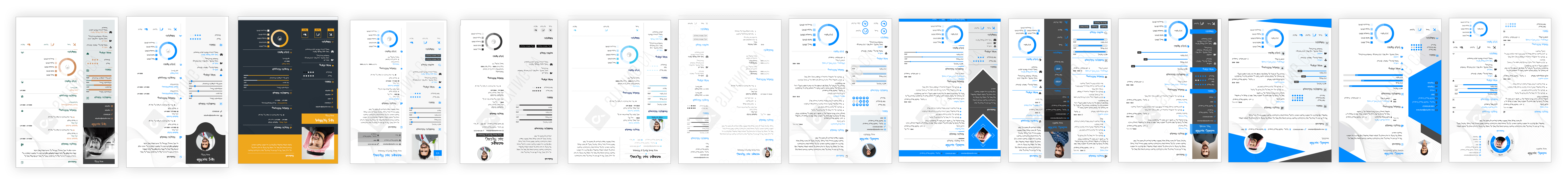
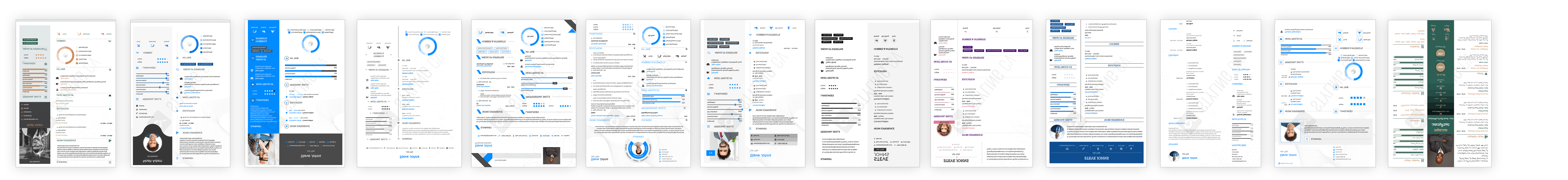
Top Resume Templates That Avoid Looking Spammy
Need inspiration? Check out these professional options:
- Minimalist Pro: Streamlined design with bold headers and zero clutter.
- Executive Standard Balanced white space + classic typography for corporate roles.
- Modern Edge: Subtle color accents in muted tones for creative industries.
Customization Tips for Your Resume Template
- Personalize conservatively: Add a header color but skip animated icons.
- Delete unnecessary placeholders: Remove filler text like “insert your skills here.”
- Prioritize readability: Use bullet points for achievements instead of paragraphs.
- Avoid graphics-heavy designs: Logos or infographics can flag resumes as “spam” to ATS software.
Why a Professional Template Matters
A polished resume builds trust before you even meet an employer.
Templates from StylingCV’s collection, for instance,
are designed to highlight qualifications without distractions.
Testing shows simplified layouts boost readability by 40%—making hiring managers more likely to notice your expertise.
Questions & Answers: Avoiding Spam-Looking Resumes
How do I know if a resume template looks too spammy?
If it has more than two colors, flashy icons, or unclear sections, it likely looks unprofessional.
Can creative fields use colorful resume templates?
Yes—but stick to muted tones (e.g., navy blue) and minimal design flair.
Do hiring managers dislike unique resume designs?
Overly unique templates (like non-traditional shapes) often backfire by reducing readability.
Should I avoid all graphics on my resume?
Avoid unless you’re in a visual field (e.g., graphic design). Even then, link to portfolios instead.
How important is font choice for avoiding spammy resumes?
Critical—fonts like Times New Roman feel dated; opt for modern sans-serifs like Helvetica.
The Bottom Line
Avoiding spammy resume templates means prioritizing clarity over creativity.
Stick to clean layouts, professional fonts, and subtle personalization.
Ready to upgrade? Browse professional CV templates here,
and choose one that lets your qualifications—not gimmicks—shine.
Related articles

Build your resume in 10 minutes
Use professional field-tested resume templates that follow the exact ‘resume rules’ employers look for. Create My Resume
BUILD MY RESUME NOW